The <details>
🤯 🤪 Of a Dropdown
<details>
How to build a beautiful dropdown panel with just HTML and CSS
I would by no means consider myself as an expert when it comes to HTML & CSS. But I thought I just share what I found to work really well for me, when I tried to build a dropdown panel without any JavaScript.
You can build a fully functional dropdown panel by using plain HTML and CSS with no JavaScript involved by leveraging the <details> and <summary> tags. Here’s a minimal example:
See the Pen details & summary – dropdown (minimal example) by Paul Götze (@paulgoetze) on CodePen.
If you want to see more advanced dropdowns built with this approach and want to learn about what’s going on here, then read on…
There is an HTML tag that might count among the little known but most powerful tags in the world of websites: the <details> tag.
It usually appears together with another tag that makes the <details> tag shine: the <summary> tag.
It basically does what it says – it shows you a summary. And you can click on it to see some details. The best feature is, that it comes out of the box with each browser, no JavaScript needed for toggling the details. Just plain old HTML. Here’s what it looks like by default:
See the Pen plain details & summary by Paul Götze (@paulgoetze) on CodePen.
Wow, not sparking too much joy, yet. But we’ll get there.
Let’s Spice It Up 🌶️
With a bit of styling, the plain <details> and <summary> snippet from above can already be used for such exciting things as questions (summary) and answers (details) on your FAQ page.
But let us explore some even more exciting use cases. Let’s build a dropdown menu that might live in the navigation on your web page.
First, we put a container around our <details> snippet which will represent the dropdown element. Then we replace the former summary text with a hamburger menu icon and insert a list as the actual dropdown content. Last, we wrap the whole dropdown with a <nav> tag and give all of that some quick color styles. Et voilà:
See the Pen plain details & summary by Paul Götze (@paulgoetze) on CodePen.
Hiding The Disclosure Widget
The <details> tag comes with an open attribute and a disclosure widget (▶, ▼) which indicates whether the dropdown is opened and details are visible. Let’s hide this marker, so that the click area looks more like a general button.
In Firefox we can do so by setting list-style: none; for our summary. In other browsers you need to apply display: none; for the summary’s pseudo-class ::-webkit-details-marker.
We’ll also fix the cursor behavior for the <summary> on the fly. So, this is what we end up with after applying these fixes:
See the Pen plain details & summary by Paul Götze (@paulgoetze) on CodePen.
Detaching The Details
This might already serve well as a simple dropdown menu. But we can do much better.
Right now, when opening the details, the content enlarges the details container and therefore also pushes down any other content that lives below our navigation bar. In more complex navigations we might like to have a dropdown panel that is detached from the triggering summary. So, next up, we’ll add some styles to display the actual menu content in a position-wise independent panel.
We can get an independent menu content by adjusting its position property. Hence, we wrap our content into a <div> container and give it an absolute position. With this, the opened menu content is now displayed directly below the summary, which is the opening trigger for our dropdown menu.
In order to define if the panel is opened to the left or the right of the triggering summary, we apply a position: relative; for the dropdown <div> container. You can now customize the dropdown panel’s anchor by applying right: 0; or left: 0; (which is the default) to the summary. When using a relative position, we also need to make sure the dropdown panel has a minimum inline size of its maximum content width – else our menu items will have unwanted line breaks.
By giving the dropdown <div> container an additional display: inline-block; we make sure the dropdown panel only opens when clicking the hamburger menu icon directly.
Similar to before, we also add some list styles to make it already look like a menu and make it more distinct from the navigation and the text content below:
See the Pen details & summary – dropdown III by Paul Götze (@paulgoetze) on CodePen.
Closing The Menu
Opening and closing the dropdown works nicely and it looks like a navigation menu alright. However, there’s still an issue if we open our menu and decide to not click anything in it but leave for interacting with other content on the page. Then our menu will still be wide open and cover underlying content.
So, we need to figure out how to close the <details> again, whenever we click somewhere else outside the menu area.
We can use a neat little trick to reach this behavior – again without any JavaScript involved. When the <details> container is in the open state, then clicking any <summary> content will hide the menu content. We can leverage this behavior by making sure, that the only area we can click on outside the menu content will always be the <summary> area. So, a click anywhere else on the page would always trigger closing the menu.
Technically this is possible by enlarging the summaries ::before pseudo-class to the full view size. This is done by giving it a fixed position and expanding it to all four view corners (setting top, right, bottom, left to 0). In order to fill the whole screen we also need to set the content of the ::before pseudo-class. By default the details content is displayed with a higher z-index than the related summary content, so we don’t need to care about this. You can still interact with the menu content. The next example applies a transparent background color for the summary::before’s content, so that we can see the area covering the entire screen behind the menu content:
See the Pen details & summary – dropdown IV by Paul Götze (@paulgoetze) on CodePen.
Conclusion
We built a fully functional dropdown menu without any JavaScript by using the <details> and <summary> HTML tags and some CSS styles.
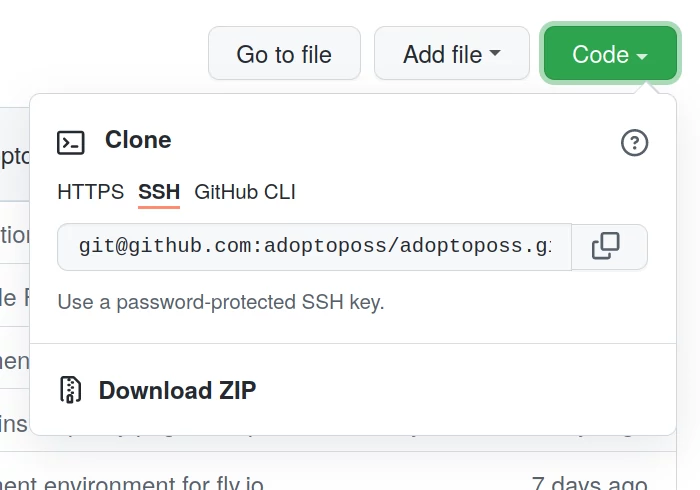
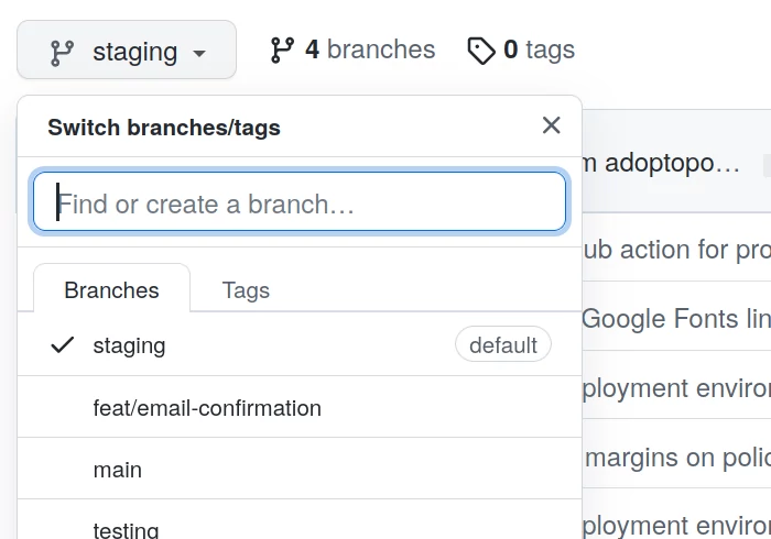
This approach can be used for a multitude of different dropdown panels, including navigation menus, sharing widgets, and all sorts of buttons that open a panel with further details or actions. In fact, GitHub is using a similar approach for their clone button and the branch select panel – which is also where I took inspiration from to kind of reverse-engineer the described approach:
With some minor additions and a couple more CSS styles we can make our example into a shiny dropdown menu, that works just as you would expect a dropdown menu to work:
See the Pen details & summary – dropdown V by Paul Götze (@paulgoetze) on CodePen.
As long as you don’t want to put any more complex interactions into the dropdown, the described approach does not need any JavaScript. However, if you don’t have a page reload after clicking a link in the dropdown panel, you would need to add some JavaScript to toggle the <details>s open state. The same applies for any additional actions from within the dropdown panel that should change its open state.
I hope you learned some useful details about how to build dropdowns. We can give the positive summary that you might not always need JavaScript to build interactive web components. HTML and CSS might have you covered in more cases than you think. For dropdown menus and dropdown panels it certainly does.